
The tools at a marketer’s disposal are as varied as they are dynamic.
Among these, CTA buttons, pop-ups, and banners stand out due to their direct interaction with users, playing pivotal roles in converting casual visitors into engaged customers.
From the psychology behind their design to real-world examples from well-known companies, this article will explore how CTA buttons, pop-ups, and banners aren’t just decorative website elements but crucial drivers of business success.
So, let’s get right to it!
The Role of CTA Buttons
Call-To-Action (CTA) buttons are among the most direct and impactful tools in digital marketing, designed to guide users towards taking a desired action, whether it’s subscribing to a newsletter, making a purchase, or any other key conversion goal.
The effectiveness of CTA buttons depends not only on their placement and design but also on their ability to communicate compellingly with potential customers.
Studies show that personalized CTA buttons can increase conversion rates by up to a whopping 202%!
Not only that, but a compelling CTA button that resonates with the target audience and feels relevant to their specific needs or interests is much more likely to be clicked.
Additionally, the placement of CTA buttons also plays a crucial role in their effectiveness. For instance, CTA buttons that appear above the fold (the part of the webpage visible without scrolling) are 67% more likely to be clicked than those placed below the fold.
By focusing on the language, design, and placement of these buttons, marketers can significantly enhance their effectiveness, leading to improved user engagement and increased conversions.
To put things into perspective, here are a couple of effective CTA examples from popular websites:
Amazon’s “Buy Now” Button:
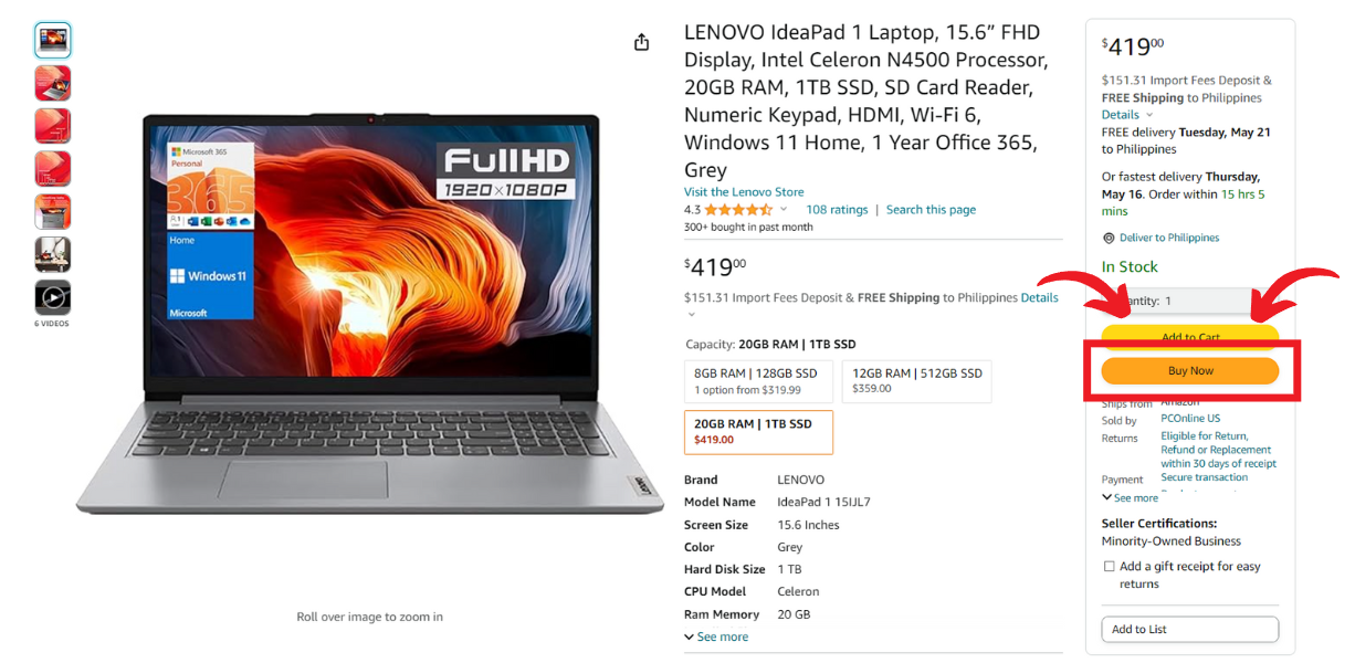
Amazon, a big player in the e-commerce sector, expertly uses CTA buttons to streamline their purchasing process.
The “Buy Now” button is prominently displayed, uses contrasting colors to stand out, and simplifies the checkout process to a single click.
This immediacy and visibility significantly boost conversion rates by reducing shopping cart abandonment.
YouTube Premium’s “Try 1 Month For $0”:
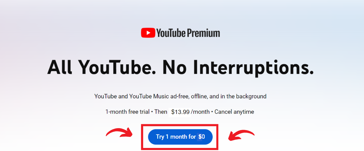
YouTube Premium uses a CTA button that not only prompts immediate action but also highlights a no-cost trial.
The button is typically featured at the center of their homepage, immediately catching the eye of potential new subscribers.
The use of inviting language and the promise of a free trial effectively encourage sign-ups.
Understanding Popups
Pop-ups, when executed correctly, can be a highly effective tool for increasing conversions, capturing attention, and even gathering user feedback.
However, the key to harnessing the power of popups lies in their strategic implementation and timing to enhance rather than disrupt the user experience.
Here we’ll explore the various types of popups and how successful companies have employed them to achieve significant marketing goals without alienating their audience.
Types of Popups
- Entry Popups: These appear as soon as a visitor lands on a website’s landing page or home page. While they can be perceived as intrusive, they are effective for offers that are highly relevant to the audience.
- Exit-Intent Popups: These are designed to appear when a user is about to leave the site and offer one last chance to convert visitors by presenting a special offer or a reminder.
- Timed Popups: These are triggered after a user has spent a predetermined amount of time on a site. They can be useful for engaging deeply interested visitors with additional content or offers.
How To effectively strategize your pop-ups
The challenge with popups is ensuring they add value without frustrating users, and the best ones are those that feel like a natural extension of the user journey, not interruptions. They should be:
- Relevant: Tailor popups based on the content the user is viewing or their behavior on your site.
- Timely: Display popups at a point in the user’s journey where they are most likely to appreciate the information or offer provided.
- Non-disruptive: Make sure that the popup can be easily dismissed if the user is not interested, maintaining a positive user experience.
Successful Popup Examples
Nike’s colorful and Eye-catching Popups
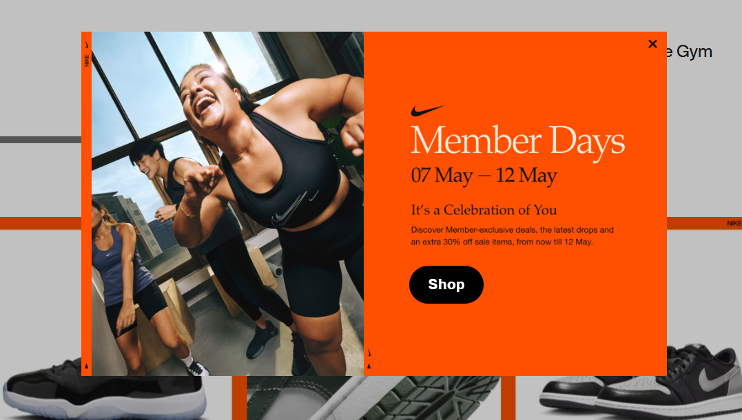
Nike effectively uses timed popups on its website, especially targeting visitors who have been browsing through their product pages for a significant amount of time.
These pop-ups often offer a personalized discount or highlight limited-time offers, encouraging immediate purchases.
Spotify’s sleek and minimalistic popups
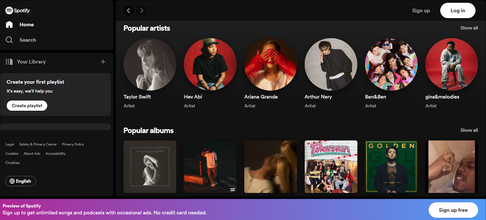
Employing exit-intent popups, Spotify captures users considering leaving the site by offering a special discount on their premium service.
This tactic not only reduces potential subscriber churn but also enhances conversion rates by providing a last-minute incentive to stay.
The Importance Of Banners
Banners are a staple of digital advertising, providing a blend of visual appeal and strategic placement to catch the eye of potential customers.
This section explores various types of banners, their effectiveness in driving brand awareness and conversions, and how they fit into an overall marketing strategy.
Types Of Banners
Banners come in various formats, each serving specific strategic purposes within digital marketing:
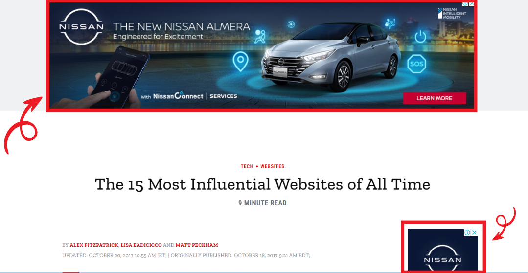
- Static Banners: These are the most traditional form of banner ads, displaying a fixed image. They’re often used for general brand advertisements and are placed in high-traffic areas on websites to maximize exposure.
- Animated Banners: These banners include elements that move or change without user interaction, catching the eye more effectively than static images. These are particularly useful for conveying complex messages that benefit from dynamic presentation.
- Interactive Banners: These allow user interaction, such as scrolling over to trigger a change or clicking to reveal more information, which engage users more deeply and can lead to higher engagement rates.
Real-Life Examples Of Successful Banner Ads
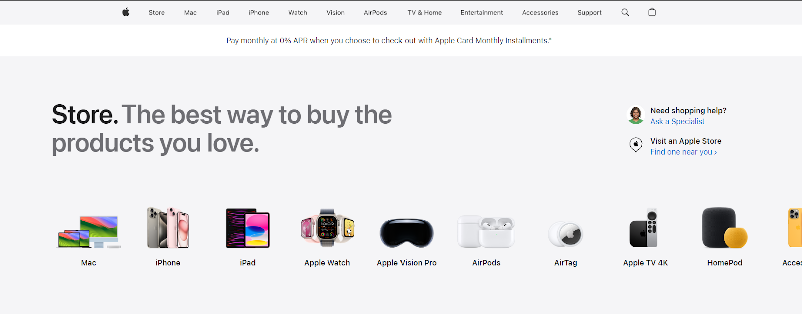
Apple’s Minimalist Banner Ads
Apple often uses simple yet sleek banner designs that align with its brand aesthetic, promoting new products or features. These banners are strategically placed on technology blogs and news sites to target tech-savvy consumers.
Google’s Targeted Banner Campaigns
Google employs banners that dynamically change based on the user’s browsing history and preferences, making the content highly relevant and increasing the likelihood of clicks. This kind of personalization makes the ads more effective and less intrusive.
8 Cohesive Strategies for Integrating CTA Buttons, Pop-ups, and Banners into your marketing tactics
- Develop A Consistent Design: Ensuring that CTAs, pop-ups, and banners share a consistent design language and tone is crucial. This consistency helps in reinforcing brand identity and improving user trust and recognition.
- Strategically Place And Time Your Ads: Each element should appear at the optimal time and place in the user journey to complement the others. For instance, a popup might gather initial interest, a CTA button can drive immediate action, and banners can provide additional information or reminders.
- Limit Frequency Of Popups: Too many popups can annoy users and lead to site abandonment, so it’s important to use them sparingly and only when they add value to the user’s journey.
- Only Have Relevant Banners: Banners should be relevant to the content the user is engaged with. For example, a banner placed in the header area promoting a related product or service can appear as users scroll through related articles or product listings.
- Create Actionable CTAs: CTAs should be clear, compelling, and relevant to the content around them, guiding users towards the next logical step.
- Use Analytics Tools: Tools like Google Analytics can help track the performance of each element, from how many times a CTA is clicked, to how often a popup converts, or how a banner drives traffic to your website.
- Conduct A/B Testing: Regularly testing variations of CTAs, pop-ups, and banners can reveal what combinations work best together to achieve marketing goals.
- Utilize Feedback Loops: Implementing mechanisms to gather user feedback on these elements can provide insights into how they are perceived and how they can be improved.
Boost Your Marketing Strategy Now!
Whether you’re managing a startup, part of a dynamic marketing team, or overseeing digital strategies at a large corporation, understanding the strategic use of CTA buttons, pop-ups, and banners can greatly enhance your engagement and conversion rates.
From boosting online sales to increasing newsletter sign-ups, these tools are integral for successful digital marketing campaigns.
Curious to learn more about leveraging tactics for your online business effectively?
Join our email list for free to receive insights, tips, and real-life success stories directly to your inbox and stay on top of the latest trends and techniques in digital marketing by learning from the achievements and hurdles encountered by industry leaders!